Search for articles, topics or more
browse by topics

Search for articles, topics or more
What is involved in planning an illustration? How do you approach your drawings and which are the most difficult stages?
Planning an illustration means starting from a concept that has to be communicated clearly and synthetically through an image. “To illustrate” comes from Latin and means “to illuminate”, so first of all you have to understand exactly what you have to convey to the public. Without this premise, you can’t proceed. Once you have understood the theme, creativity intervenes and it becomes about seeing and illustrating that particular world from a fresh, new and personal point of view. This process of understanding and interpreting according to your own sensitivity is probably the most difficult and delicate stage; it’s a balance between your own vision and the values that you have to convey, which cannot be deformed or misunderstood. The rest is technical work and craftsmanship.
Tell us about your cooperation with Molteni&C for the Molteni Group’s magazine
Molteni&C‘s rich history is particularly stimulating for an architect/illustrator like myself, who especially appreciates the designers who have left their mark, not only on the world of architecture and design, but also on paper. In the process of making the various sketches that led to the final illustration, I examined and was greatly moved by the extraordinary drawings of designers such as Aldo Rossi, Gio Ponti, Ignazio Gardella and Luca Meda, just to mention a few. In the story of Molteni&C, my interest in drawing freehand on paper rediscovered so many graphic works that had preceded the end products, and which represent a theory of images full of suggestions, design expertise and great artistic value. Just like Giovan Battista Piranesi in the 18th century, these 20th-century architects were great draughtsmen, so their graphic works enlighten us more than a thousand theoretical treatises on their visions or personalities. In our search for various different approaches, we agreed to communicate Molteni&C in its most contemporary dimension, with various references to the protagonists that I just mentioned and to the city of Milan itself.
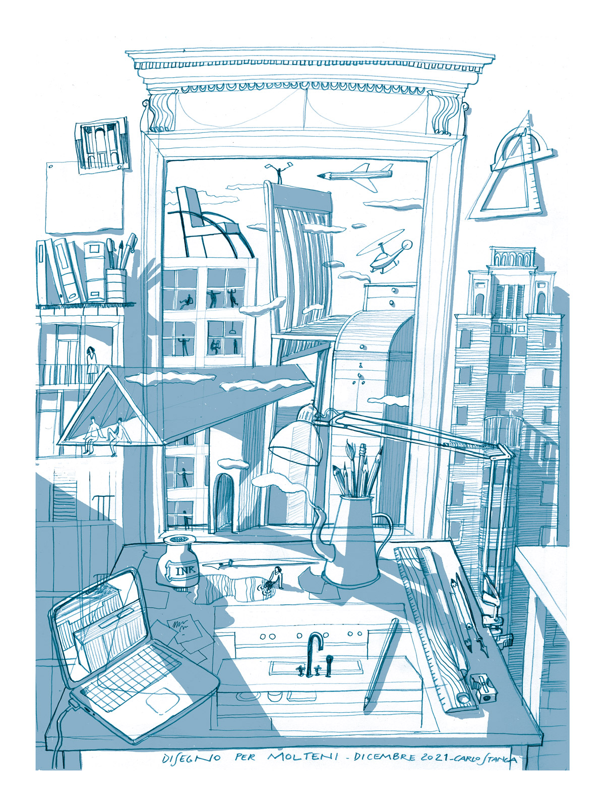 Carlo Stanga | Disegno per Molteni
What inspired you to produce the illustration and how important is it to have in-depth knowledge of the identity and history of your design’s subject?
My conversation with Molteni was crucial for identifying my approach. Sources of inspiration were of great importance for understanding the history, the contemporary nature of the designs, and the aforementioned references to the designers’ wonderful drawings. Then, of course, attention to the contemporary language of the group pointed me to the climate, environment, light and colours. I was keen to convey the presence of nature, not by representing it directly, but by evoking it through the use of light and shade. I started, as always, from a drawing on paper and then researched the colours digitally, interpreting the colour palette of the Molteni Group’s more recent images, filtered through my own perspective. I think I managed to translate Molteni’s identity, without altering my own language – which was actually enriched by fresh input.
Is illustrating the cover of a book or magazine a responsibility or a privilege? What differences are there with other types of illustrations?
The cover is effectively its face, without any kind of mask, so it has to suggest not only the contents, but also the personality of the publication. It is definitely a demanding assignment where, once again, awareness of the contents and that magazine’s particular ways of expressing itself, has to be respected.
How can you summarise so much complexity in a single image?
By concentrating on distilling the rich contents, which you have to understand well, while still managing to focus on their essence with a skilful use of strokes, light and colour. I frequently draw illustrations crowded with details because I love recreating the complexity and sensory richness of urban spaces in particular. The greatest challenge is to avoid pointless exaggeration and excess, which can lead to confusion. In the cover for Molteni&C, the relative density of details is balanced by a calm and dreamy atmosphere that corresponds to its more contemporary image.
What are the differences between illustrating urban architecture and the more intimate architecture of living spaces?
The characteristics of the urban environment and those of interior spaces are instantly recognisable and often contrast with each other. The complexity, unpredictability, confusion, speed and roar of the city contrast with domestic environments where the private dimension expresses a sense of protection, security and comfort. Beyond these more obvious considerations, however, I like to capture the continuity between the two. I actually appreciate the cultural similarity between architecture and interior design, two different scales of the same aesthetic concept. It is enough, for example, to consider the works of the great designers mentioned above to appreciate the continuity and correspondence of results in the two spheres, and to nullify the difference between them. Aldo Rossi’s architecture has the calm, colour and irony of his design objects and interior environments, while the latter are permeated by the monumentality and decorum of eternal buildings. In one of the sketches proposed for the Molteni&C project, I deliberately accentuated the continuity between interiors and exteriors, playing with structures that become furniture and design that becomes architecture, so that the architect’s studio is full of urban buildings and the panorama of the city unfolds in a theory of furniture.
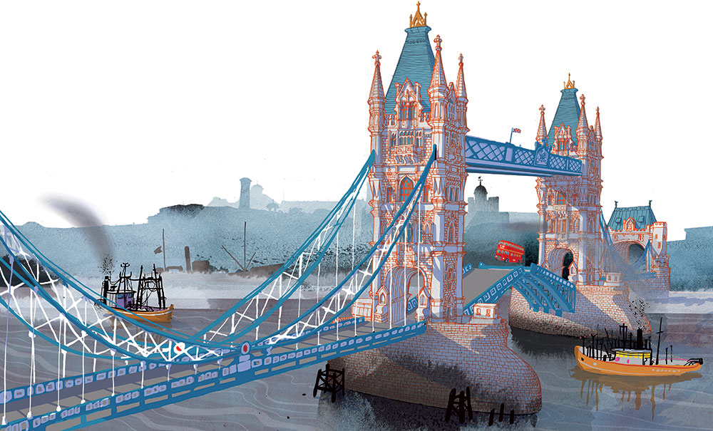 Carlo Stanga | Tower Bridge
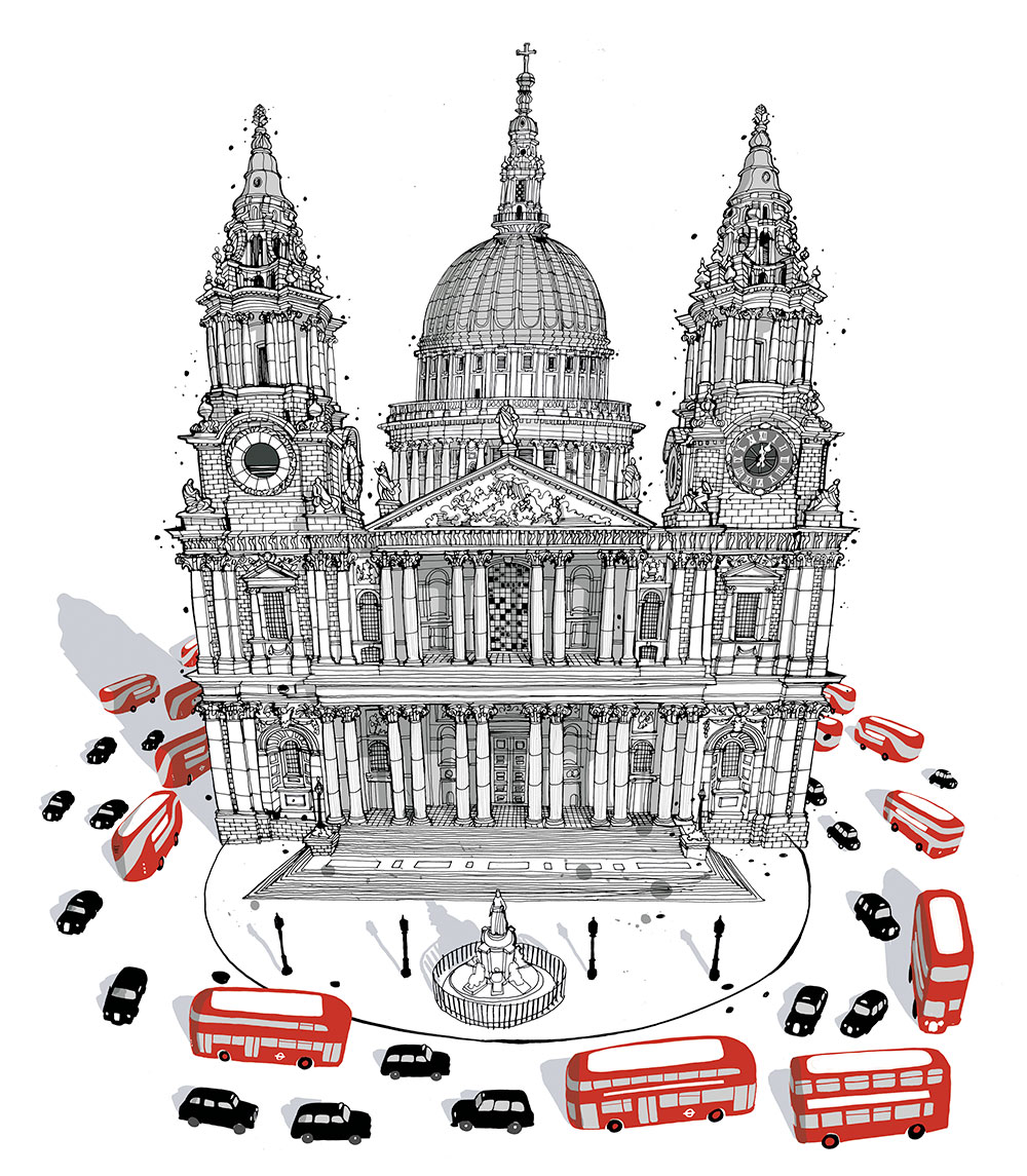 Carlo Stanga | St. Paul Cathedral
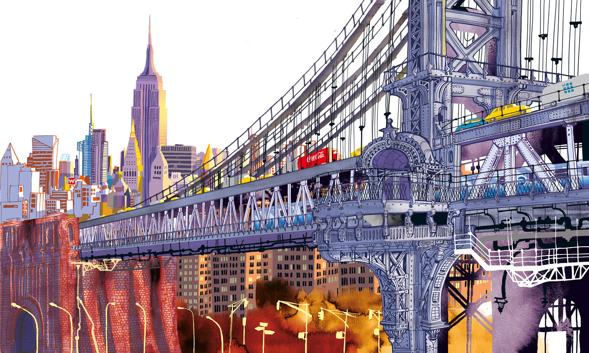
In 2015, your passion for travel gave rise to the "I am the city" series of books for Moleskine. What have you learned about the cities that you have illustrated?
Architects have always learned from cities – just think about Le Corbusier’s Leçon de Rome, Rem Koolhaas’s Delirious New York or Denise Scott Brown and Robert Venturi’s Learning from Las Vegas. My main intention was to understand cities in order to catch their essence – the unique character that distinguishes them from all others. I wanted to avoid creating books that appeared like travel guides, but rather go beyond the most predictable surface – the tourist picture postcard – to understand the uniqueness that can be recognised more in a city’s outskirts than its centre. With a layer of neon signs that light up cities all over the world, globalisation conceals the distinctive characters of urban spaces. This project aims to recover the true hidden identity of cities by means of illustration.
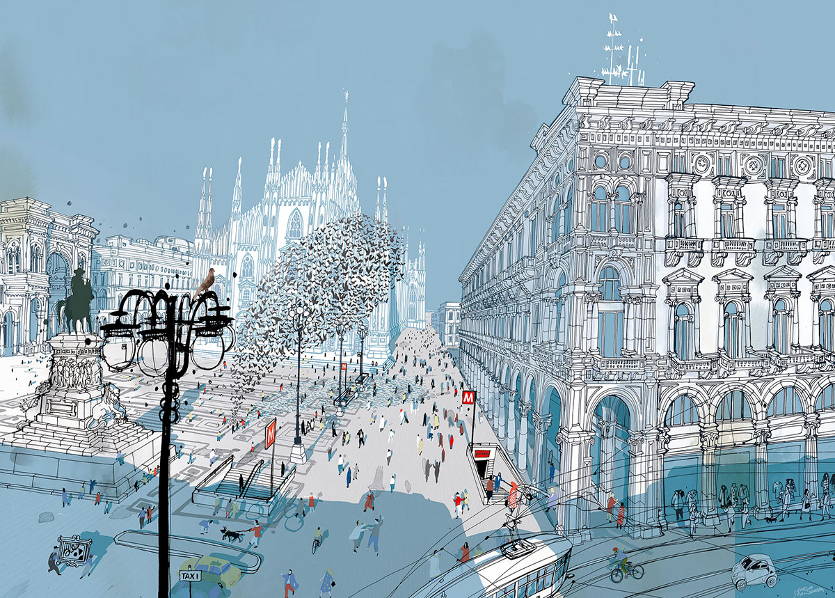
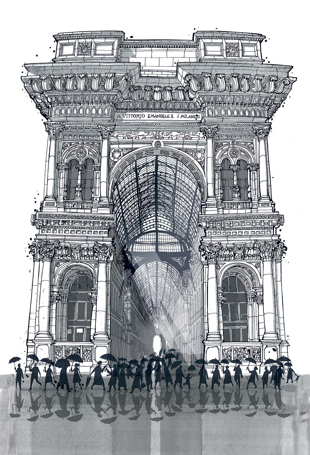 Carlo Stanga | Luce in Galleria
What about Milan, the city of design?
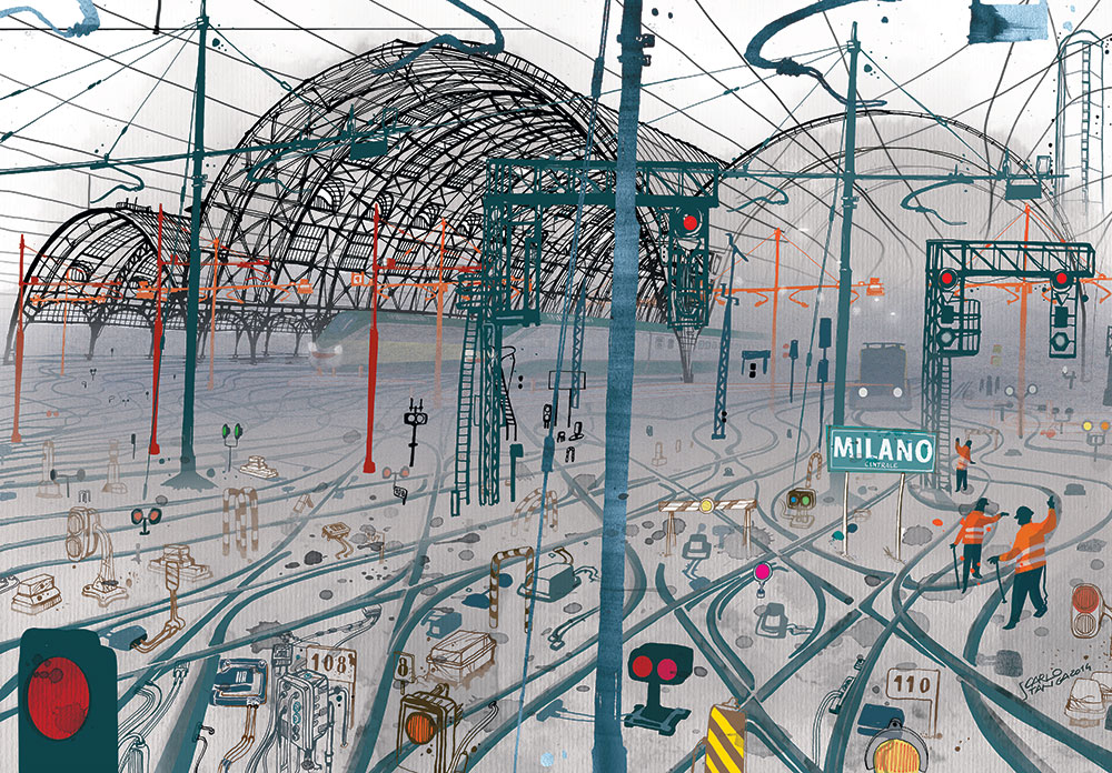
Since it is the city in which I have lived longest, and which I share complex emotional ties with, I rediscovered numerous memories of my own story with Milan. Above all, I have observed it with great attention. Drawing is, in fact, the most acute way of observing – you cannot state that you really know something until you have drawn it. The eyes are the organ that involves the greatest number of movements, which correspond directly to the number of times that the pencil moves over the paper. After having filled hundreds of sheets of paper, I can say that the main feature that emerges about Milan is the extremely high degree of quality compared to all other cities. Quality in its historic materials, from the paving stones to the marble, the bricks and the plastering; its excellent workmanship; and the love of excellence and doing good that is part and parcel of the Milanese character. Given the above, it’s no surprise that Milan is the capital of design.
Carlo Stanga
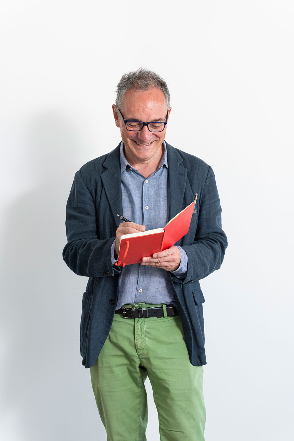
Born in Italy, Carlo Stanga has always been deeply passionate about drawing.
After graduating in architecture at the Polytechnic University of Milan, he chose to further his education with art and design studies. He collaborated with the premier Italian designer Bruno Munari, an amazing experience that influenced his way of seeing the world.
As an editorial and advertising illustrator, Stanga works with major Italian magazines and newspapers and with international clients in Europe and the US.
His distinctive style continually wins Italian Illustration awards, and the work has been selected by The American Illustration Annual, won the Gold Medal Award in Creative Quarterly’s #15 contest and Awards of Excellence from Communication Arts.
In 2015 he wrote and illustrated "I am Milan", followed by "I am London" and "I am New York", a new book collection published by Moleskine dedicated to the main cities of the world.
In 2021 he created his first children's illustrations for the book "Zaha Hadid", written by Eloisa Guarracino, published by Raum Italic, Berlin and Maxxi, Rome
Stanga lives and works in Berlin.
Each year at Chinese New Year, millions of journeys trace the same arc: a return from the city to the hometown, from distance to proximity, from the global to the intimate.
The Belgian architect and designer Vincent Van Duysen has become synonymous with one word: serenity.
Meeting of minds | A new generation of designers offer contrasting visions of the present.
Thanks for your registration.